Handshake Case Study
Handshake is a platform that connects students with employers and job events.
It allows students of different backgrounds to have the same access to opportunities — regardless of school, major, and economic status. Coming from an underprivileged background, I strongly resonate with what Handshake is striving to accomplish.
I was trying to use Handshake’s iOS application for job discovery and was having a difficult time because it was essentially the Handshake website condensed to fit on a mobile screen (basically, usability issues galore.) Therefore, I decided it would be a great opportunity to do a redesign for their mobile application.
This redesign was informed by user feedback collected from students as well as data that was collected from different online surveys.
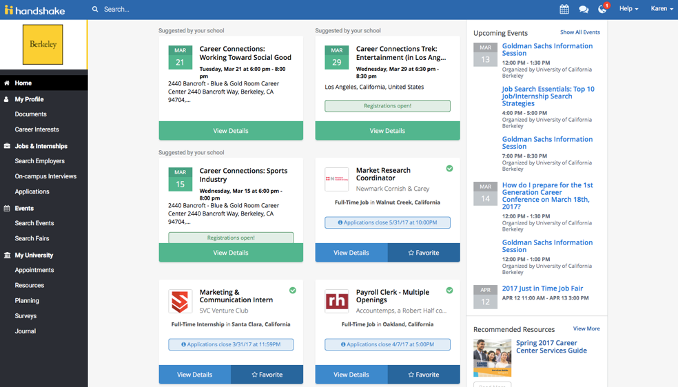
Handshake Web Landing (2017)
01. The Challenge
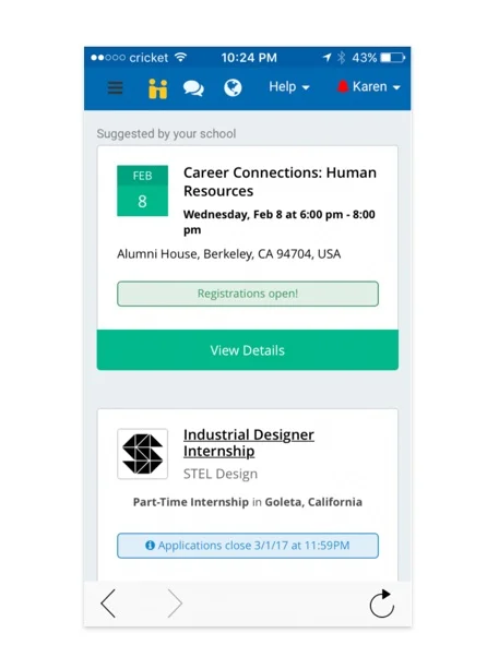
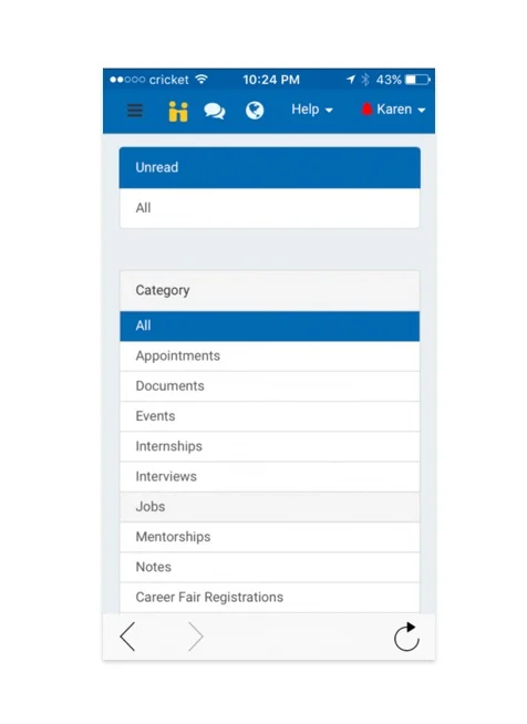
Handshake’s iOS application was a condensed version of their Web experience, which meant that there were many usability issues. Since the app was not designed for mobile, the entire experience was fragmented and difficult to navigate.
As a result, I decided it would be valuable to audit and critique their mobile experience to get a better understanding of how to tackle this redesign.
02. Current App Critique
NAVIGATION
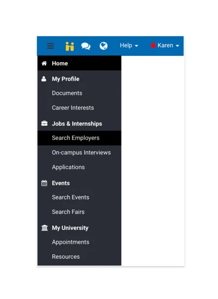
Both a hamburger menu and a top navigation bar
On mobile, these are some of the most difficult places to reach with one hand
Hamburger menu hides a lot of features which lowers discoverability
Navigation elements are unlabeled and vague, making it unclear as to where each element will lead
Convoluted navigation hierarchy makes it difficult for a user to find what they
HOME
A hub where user views curated & suggested jobs and events
User cannot dismiss any jobs or events that are not relevant
User can save jobs that they are interested in
JOBS & INTERNSHIPS
After landing on this screen, user immediately sees an extensive list of filters that spans past the viewport
This hides content below that is valuable to this page
Job cards are text heavy and lack visual hierarchy, making them difficult to scan and parse
EVENTS
“Upcoming Events” are categorized by their type (Event vs. Career Fair vs. Appointments) instead of being displayed chronologically
This makes it difficult to identify overlapping events or which days have multiple events
Hidden below these “upcoming events” are discoverable events that are easily missed
No way of registering for an event from this view
NOTIFICATIONS
Extensive filtering system fills the immediate screen which hides important content hidden below
This may obstruct the user from completing a task
03. User Types
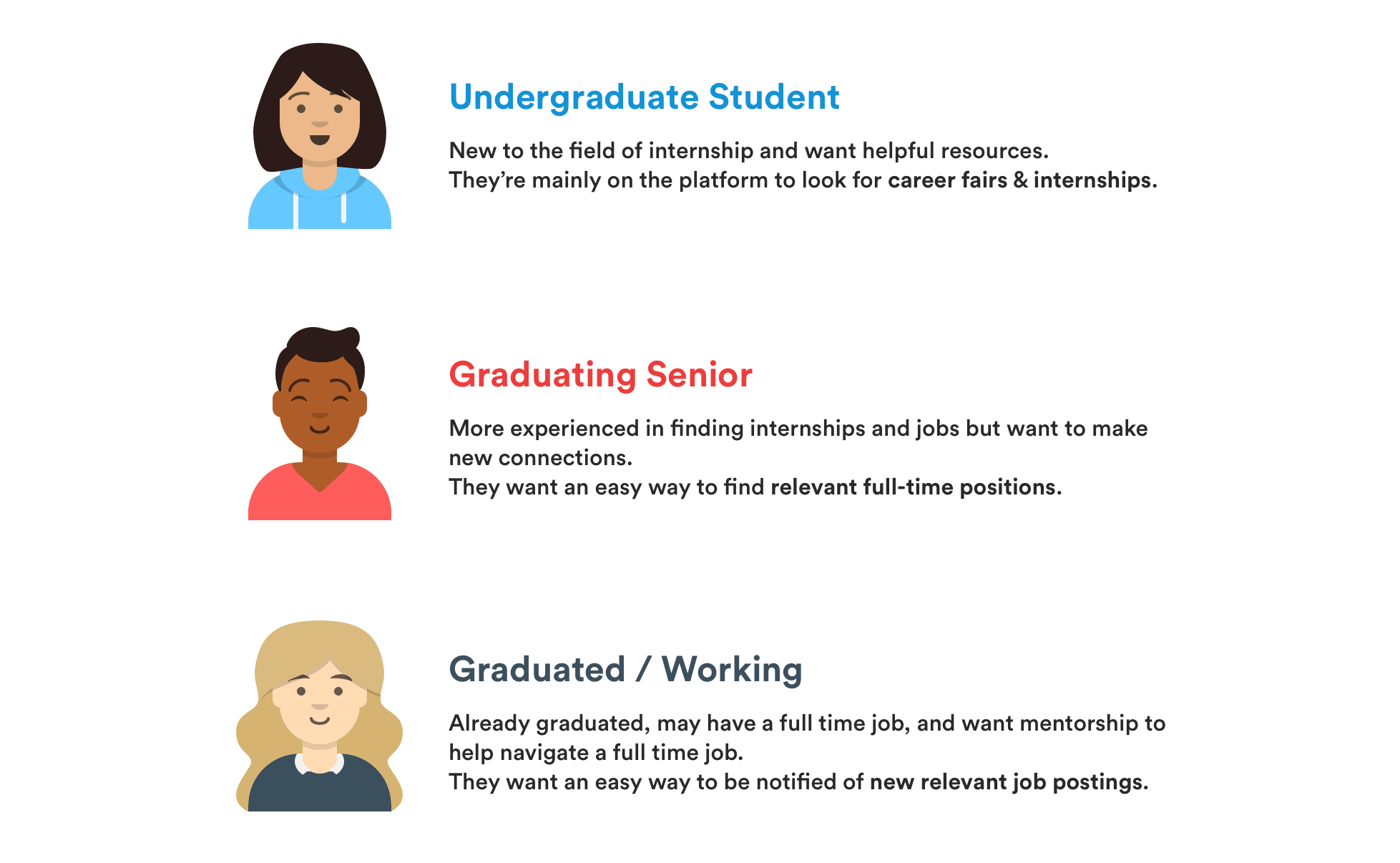
After getting a better understanding of the what the application offers and it’s strengths and weaknesses, I wanted to gather data from more perspectives.
I interviewed students at UC Berkeley to get a better understanding of what they wanted from a job/internship discovery platform and how they would use it. It was immediately clear that their jobs-to-be-done differed depending on what year students were in which provided the perfect buckets to create user types.
04. Research Findings
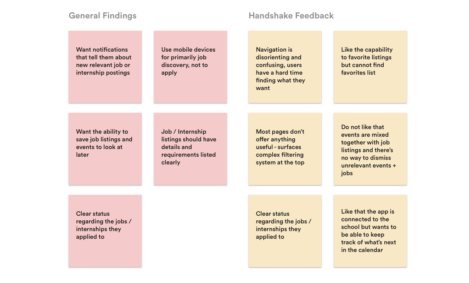
After interviewing the students about what they wanted from a job discovery application, I asked them to critique Handshake’s mobile application to gather feedback on which features and components they found useful and which they didn’t.
05. Sketches
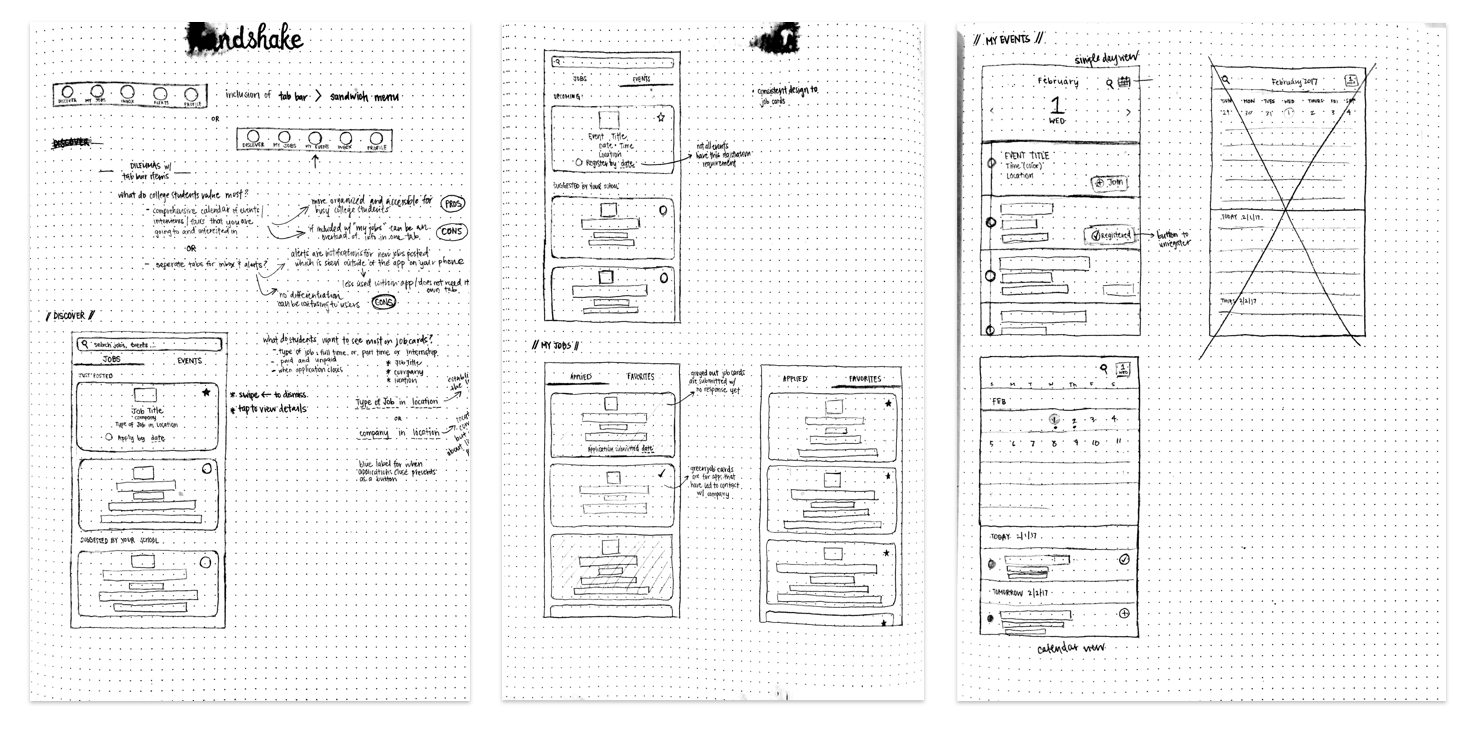
With both my app critique and student feedback, it was very clear that IA and navigation were huge flaws in the current version of the application. There was a huge amount of content that the current product was trying to support and it was not implemented very intuitively. I tackled that issue first by sketching different iterations to get them out of my head and onto paper.
Once I got to an iteration I felt like handled the complexity seamlessly, I started sketching screens to help work through content and hierarchy that I needed to include to help the user get the job done efficiently.
A few of the early sketches I created.
06. Low Fidelity Wireframes
Sketching helped me obtain a foundational understanding of the direction I wanted to go with the redesign. The next step was to digitize the sketches and create several low-fidelity wireframes to explore and help build upon that initial understanding before creating the high-fidelity solution.
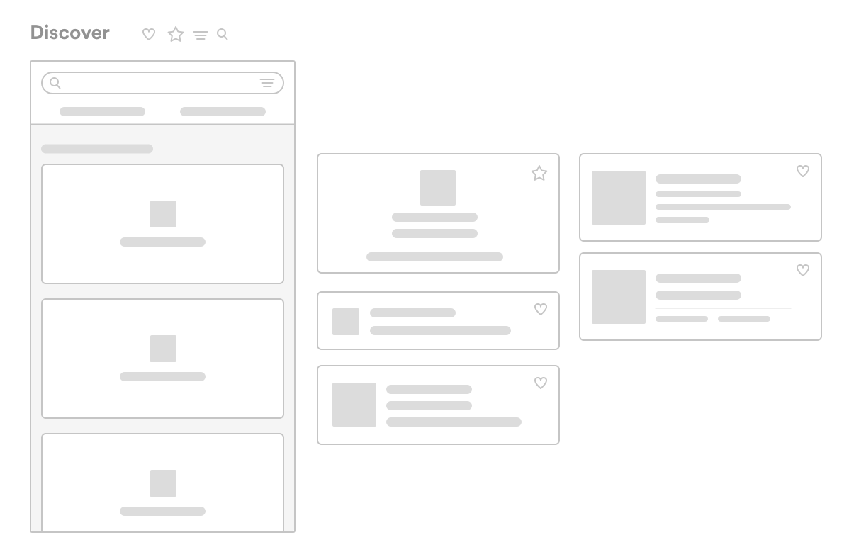
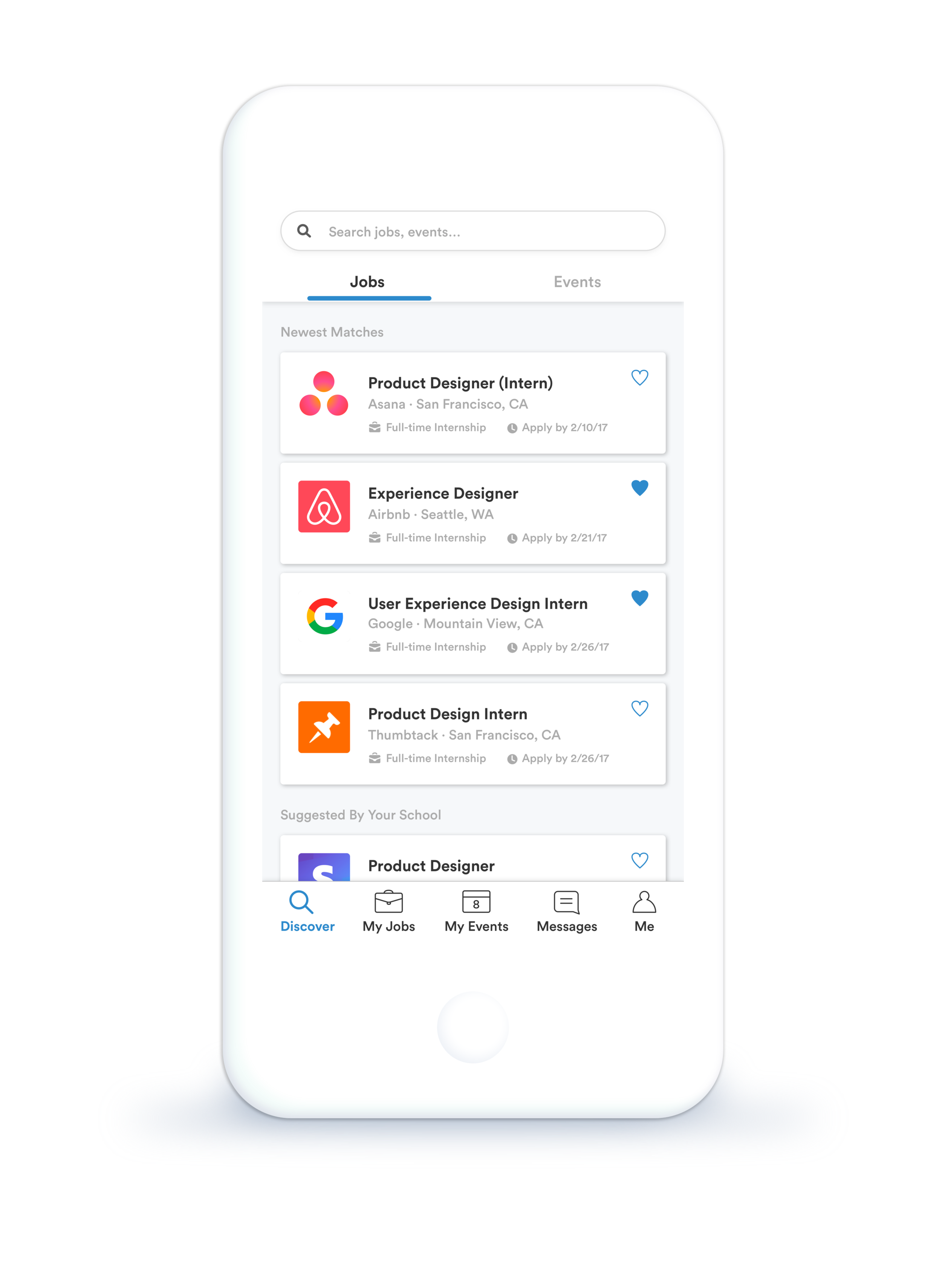
Discover Jobs
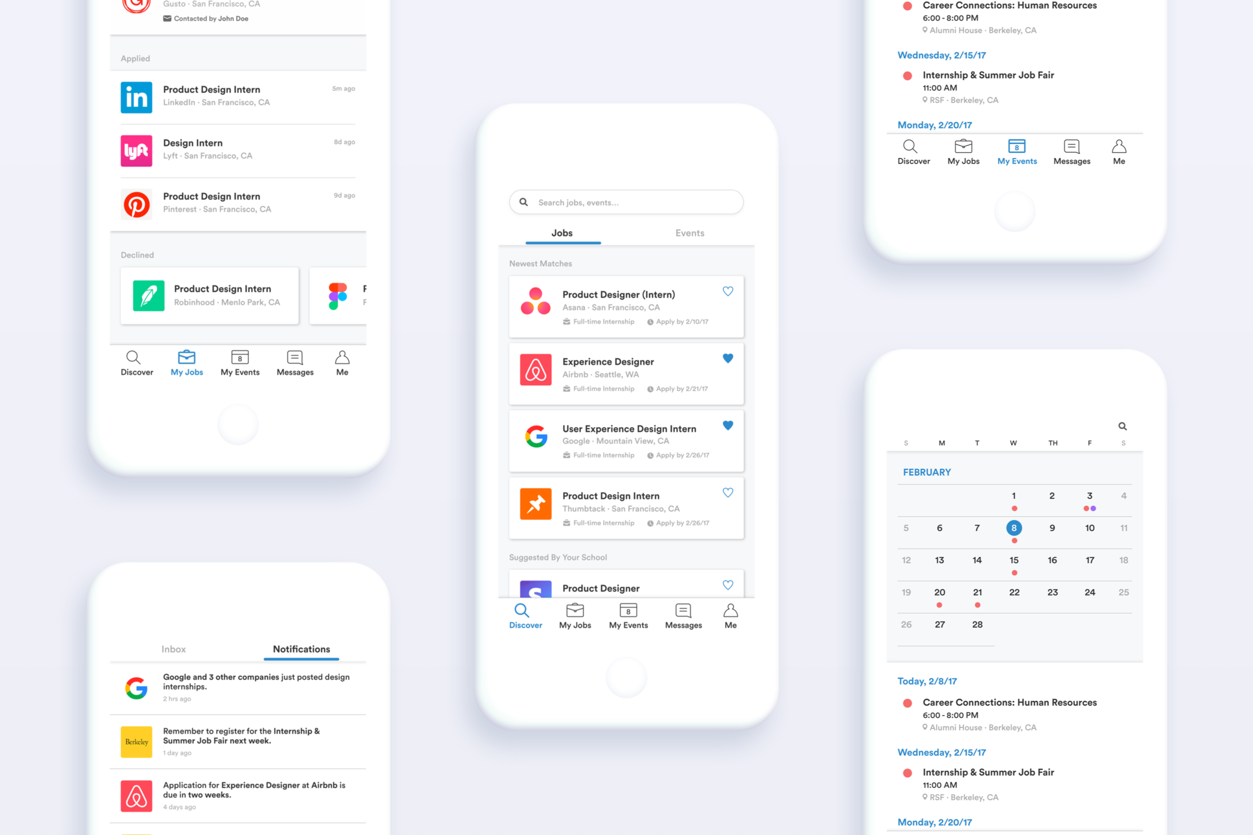
Student feedback stated that a mobile application for job finding should prioritize job discovery rather than applying because mobile devices are used on-the-go. This led me to make the discovery page the first screen a user lands on when launching the application.
Events and jobs are now separated using tabs at the top of the screen to help the user easily focus on one task at a time, whether it be looking for summer internships or discovering relevant events to attend.
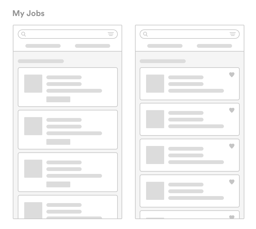
The user can save jobs that they’re interested in. Saved jobs are easily accessible in the “My Jobs” tab.
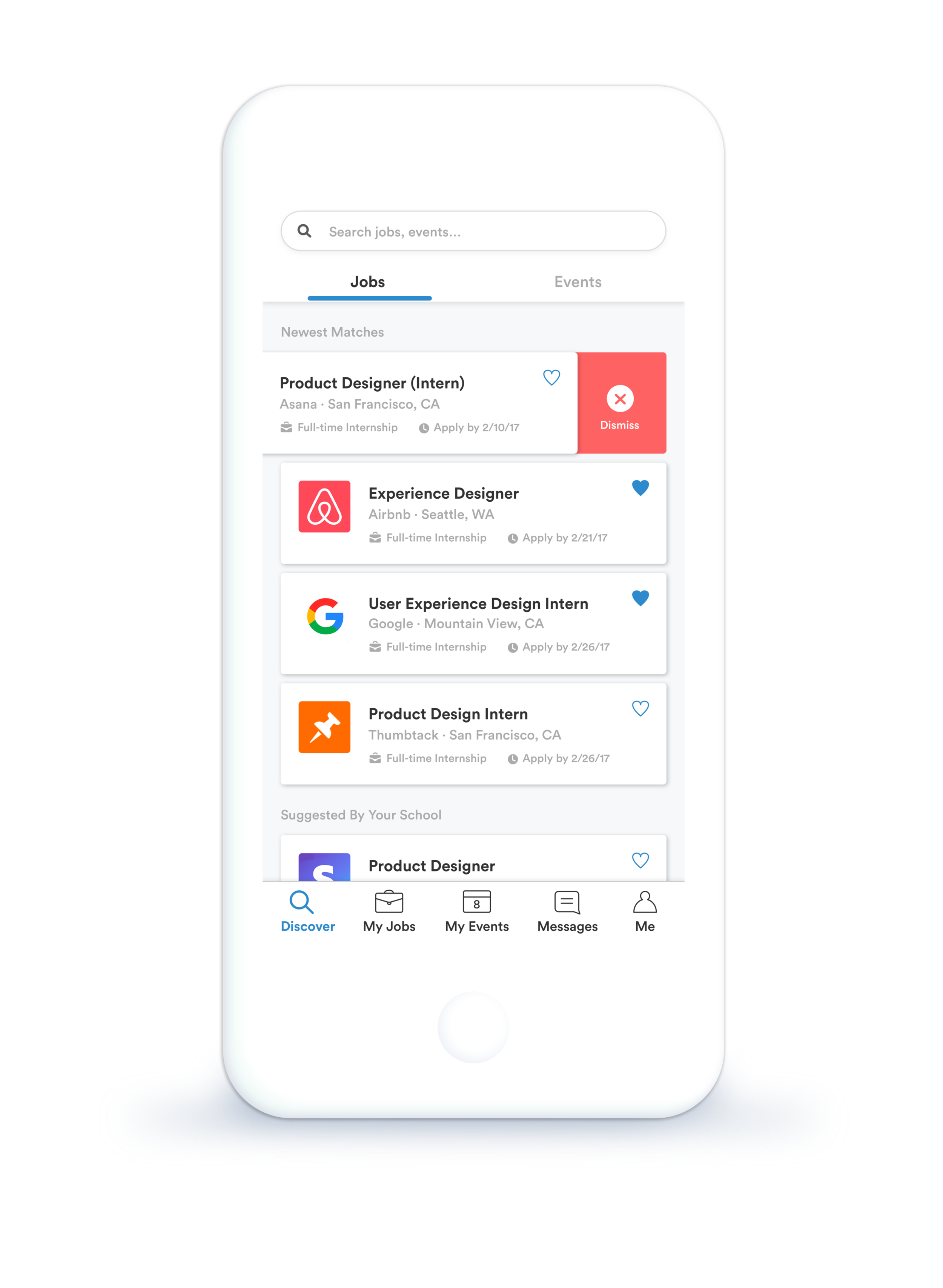
I made an intentional decision to use cards on the discovery page because it allowed for a swipe and dismiss action which gives the user more control over what they see on this feed. Cards themselves now have a clear visual hierarchy — making it easy to digest information when scanning on-the-go.
Discover Events
Events are now separated in their own tab instead of being mixed in with jobs.
The user is able to register for events easily from this view.
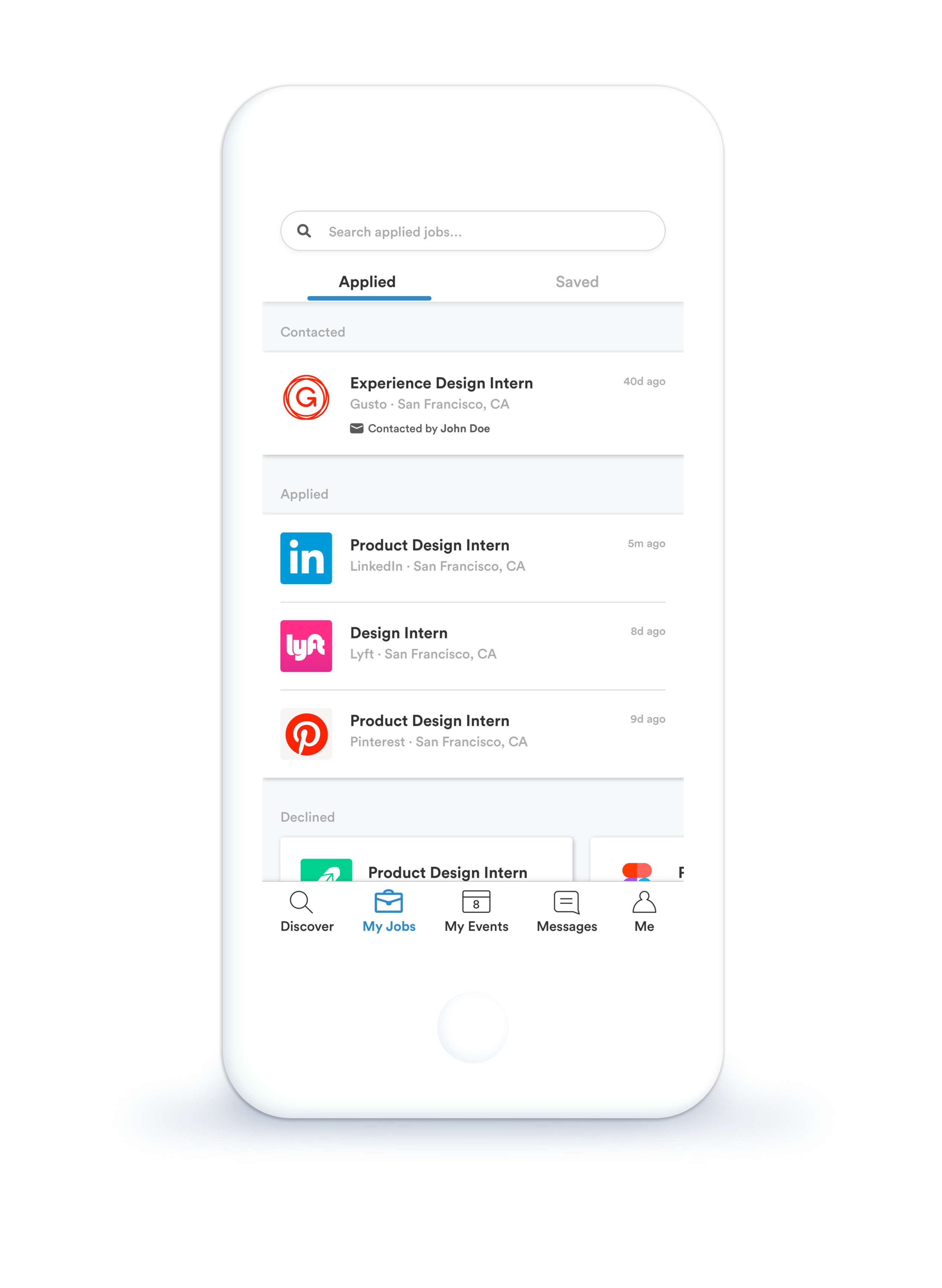
Applied Jobs
Within “My Jobs,” the “Applied” tab displays the current status for all the jobs a user has applied for. Jobs are categorized in three categories: Contacted, Applied, and Declined.
This view allows users to easily check on the status of their submitted applications.
Saved Jobs
All the jobs a user has saved is now easily accessible in the “Saved” tab within “My Jobs.”
This list view also reminds the user which of these saved jobs they have submitted applications for.
My Events
Events have a time and date component that is important to capture, so “My Events” is now a calendar view rather than a list of events.
At a glance, a user can see which days of the month have events by looking at the calendar. They can also get a more detailed view of each event in the space below the calendar.
This makes it easy to see which dates have multiple events and plan accordingly.
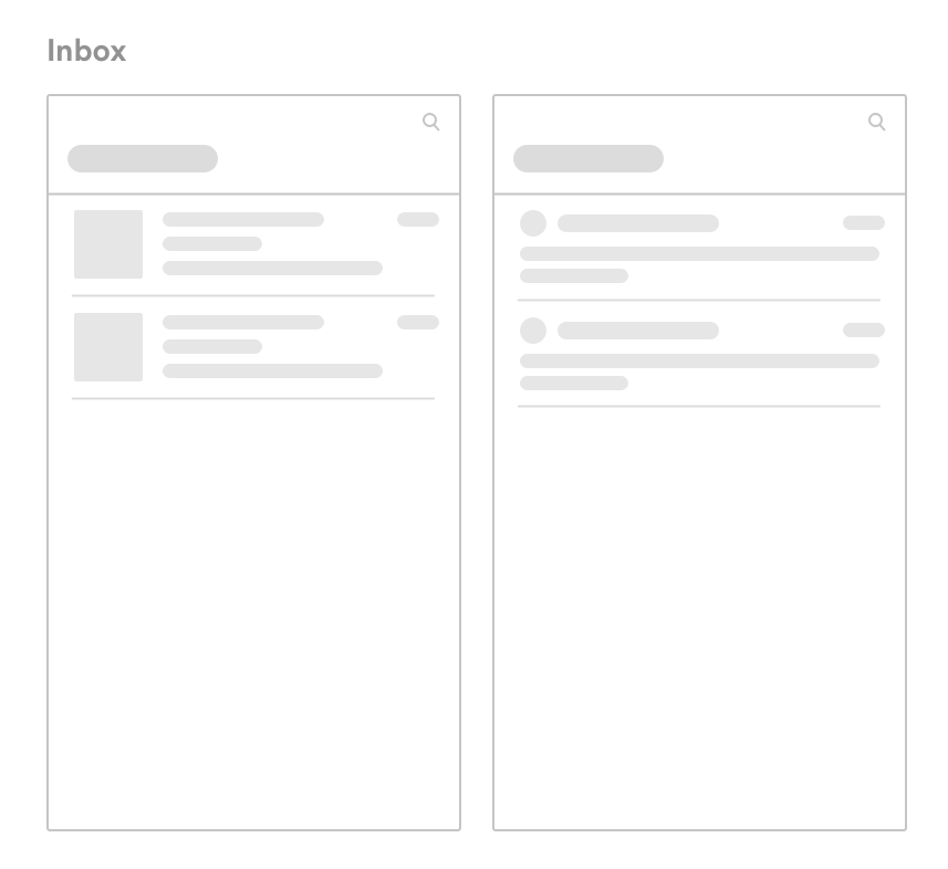
Inbox
Inbox is the primary focus of the “Messages” tab because communicating with potential employers is crucial.
The different treatment of fonts makes it easy to differentiate between read and unread messages.
Notifications
Notifications are accessible through the bell icon.
Notifications are pushed to users when an application for a saved job is due soon, when there are new job matches, and when event registration dates are coming up.
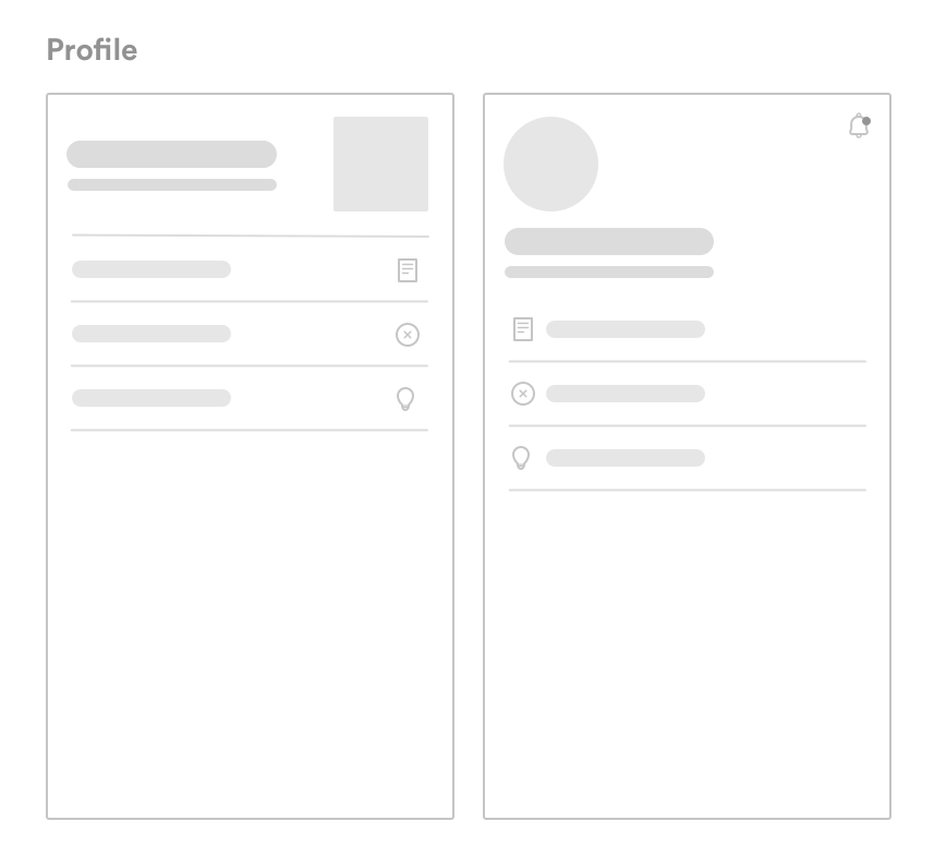
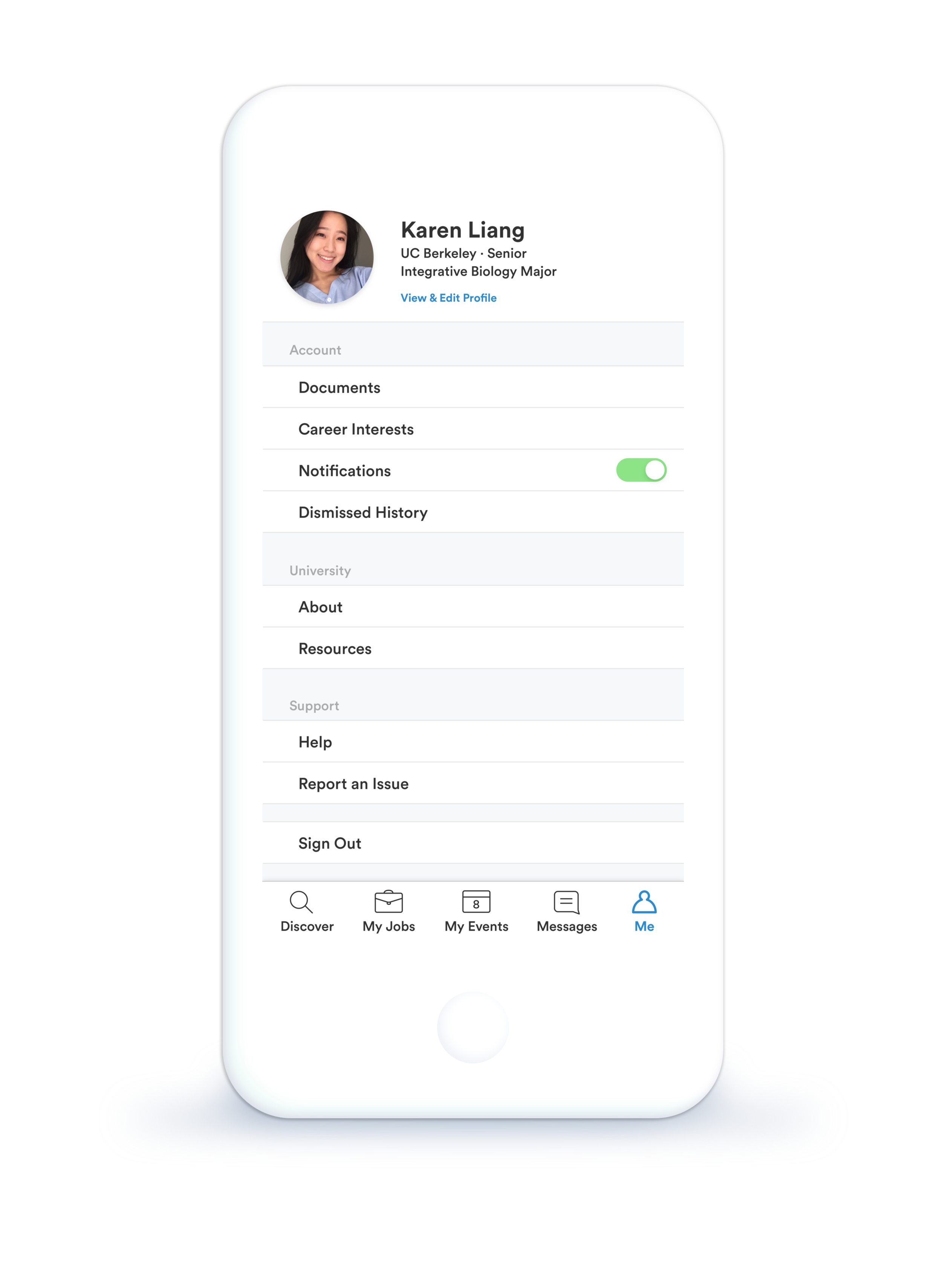
Me
The “Me” tab allows users to manage their account details in one place. They can also edit and view their public profile.
To easily turn notifications on and off, a toggle was added.
“Dismissed History” allows users to view a list of all dismissed job and event cards.
University information and resources are located here to help students who might need some extra help.
08. The Largest Challenges
Tackling this redesign was pleasantly challenging. This is first time that I have completely redesigned an application where I focused heavily on improving the IA because the current product lacks proper structure and hierarchy.
Condensing large amounts of feature-functionality into one digestible cohesive application was difficult but rewarding because the solution was such a vast improvement from its current iteration. With the redesign, the pages and content were very straightforward and it increased discoverability of features.
Another challenge I faced was making decisions with a small dataset. I only conducted user interviews with UC Berkeley students who have easy access to a plethora of companies through career fairs that take place several times a year. I didn’t get the opportunity to gather feedback from students attending smaller universities in different areas of the country, which is important considering that Handshake’s mission statement is about allowing students from diverse backgrounds to have the same access to opportunities.

